So, the semester break has just started and according to the schedule I've made, I should start on the visuals already. Thus, I did.
For the still images I used back the sketches from before, I just colored it with water color and scanned it. I also scanned some I think I can used as reference.
And so as reference, I redraw the girl in Photoshop but in timeline to get the gif of the girl's hair and dress moving.
The final gif
Took me quite some time to get it right. One time I forgot to save and have to redraw again. At least it turned okay, I guess.
While doing the visual on the other hand, I thought maybe I should start on the tutorials to do the technical. Since I thought of doing gif within a button. So I learned to do a gif using Photoshop as I never did it before from the tutorial below.
Probably will used back some of the sketches I did before as one of my medium (the hatched-styled layer drawing)
So I tried doing the gif thing in Edge. It didn't work. I followed everything given in the file (guide) but I can't make it work. Probably I'm missing something as it has no explanation much on it. I could click on the button but the gif can't be seen. Will have to find another method or probably another tutorial for me to understand better.
Then, I found a video on how to do animation in Edge. It was easy but the method wasn't really appropriate for animating (changing clip mask position, multiple keyframe and etc)
Since I do have some will be in gif or some will work in a button state, so I separate them in different layers ( different color paper = different layer). In the images that will have gif and animation, I planned on doing it in photoshop instead using the watercolor effect too. This can make it easier to animate and to save it as a gif. The background will be remained on the physical watercolor. This is just a rough.
I redraw the whole scene again and this time I labelled out which comes first or which is supposed to be added to the back.
Then I draw them in different colored paper so that it is easier to differentiate when I want to do the final product.
The overall of the layer done.
Got the sky watercolor tutorial but it doesn't go the exact same so I change a little in terms of the cloud movement. The tree I used the previous technique I learned before this.
Scene 1
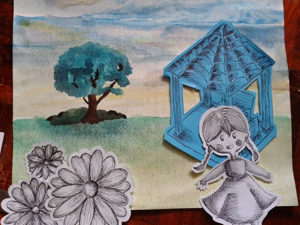
The girl and the flower will be in the front. The size doesn't follow the position but it's okay for now as I just want to know which layer they are from. The hut is placed in the middle. The walking pavement will be added when it comes to the final product.
Scene 2
The rocking horse will be at the front. Next comes the slide then the monkey bar. Lastly, it will be the swing at the back (sorry size doesn't match). They are all in different layer as they all have their different functions.
Scene 3
It can be seen that the slide is connecting from the scene 2. This shall be the part where the kids are playing hide and seek.
Scene 4
The scene where the children go home. The slide is supposed to be facing the other side but here I just use the same one.
Scene 5
The bush as connector and this is when the mother and child is walking home. The pavement will be added in the final product as I just use what I have right now.
I tried watching a few more tutorials on the watercoloring method and also trying to find the best way to color to match the type of story.
I'm trying to make my reference more obvious by making the scene more realistic to the photos I have posted before. It doesn't seem like the exact replica but at least it still have the park view.
Here I try to use watercolor to draw two of the item needed in the scene. I'm still not very sure if I should draw them as one or individually. Thought about drawing them separately but then it will look kind of parallax. But, the idea is still in mind.
At the same time, I try poster color again. Feel like I didn't want to do on just watercolor because I would thought that watercolor can be quite messy. However after this, now I doubting my skill in this.
Learned the technique of coloring a tree and use it for different object. Using this basic, I tried to draw a scene and maybe I might change the drawing style to something like this.
I'm trying different medium in case I can't find it suitable and also to see which is more convenient to me. Also, I took pictures regarding the park by my house.
Here could be suitable for the first scene, where I'm not really sure what to put in. However, I think this is quite suitable in a way that this is the entrance to the playground.
This could be when she is alone and is seen in the playground. I think this is suitable because it shows most of the play set of the playground. Of course, I would be adding more item if needed.
The three images above can be a reference for when the kids are playing hide and seek. With the trees there for the divider to the next scene.
For the part where the children walk home with their parents will be referenced from this.
Beginning watercolor testing as I'm not very good in it.
The scene is based from the last picture of the park above. Yeah sure, I changed a little as it would be a little empty in the middle. I had to do it layers by layers to avoid the color from mixing in a way that I don't want it to be.
I tested the watercolor in another paper. I thought it could be a suitable place to test my coloring skill. *I do not own the picture, it's from another source.
Next I tried poster color. It is not as a wet medium as watercolor and the color is brighter and thicker. I think it is neater to be painting in poster than in watercolor.
Here I sort of color the skin wrongly as the brown doesn't suit the peach color much. While at the bottom character I tried color pencil as it is a medium I'm much comfortable with.
Trying to mix the colors using poster color. First one is mixed from the light > medium > dark. Second is medium > dark > light. The arrangement is sort of weird though but I was testing is more practical. Third is dark > medium > light. I think it is more suitable and the color mixed nicer compared to the other two.
May go for poster color for the characters while the background in watercolor. This is because water can get messy and the characters can be small at times hence the space given may not be enough for watercolor. It can also be messy. Maybe for the touch up, I could add in color pencils too.
Watercolor tutorial that I based my technique with: